Vintage Radios

For a long time I've wanted to add some text to these image posts, maybe to add some perspective as to how they were made, and the creative insight. The idea to draw radios was actually kind of a draw-this-in-your-style type of  thing, I had seen a friend do something like this but in watercolor, and the style and design of old radios is very appealing, so I just started by searching on Pinterest for reference images.

The process is quite simple and can be broken down in 3 steps: the inital sketch to pin down the proportions, the adding in of color based on the main shadows of the piece, and the defining details which were accentuated with a plain mechanical pencil or a darker shade of the existing color. I work mainly from light to dark, gradually increasing the contrast and moving all around the drawing to keep the whole piece evolving at once - I am definitely not a fan of working in one area and finishing it, to leave another area completely blank. This latter technique has the unfortunate disadvantage of not allowing you to make a focus point in the drawing, everything would have the tendency to appear a bit flat and too even as it were.

All of the radios were drawn entirely with color pencil and mechanical pencil, except the green one, which has an initial wash of watercolor as a base.

As a side note/tip - the bigger the drawing, the more detail it allows, and thus looks better even when it is scaled down, like the golden one below, which was slightly bigger than the rest. (they were all drawn separately in the sketchbook and merged together in Photoshop)

M.

The Golden Apples


These three works were made for an exhibition of the Illustrator's Club in Brasov, Romania. 

The theme is Romanian folk tales, and I was inspired by a popular story, ''Praslea The Brave And The Golden Apples''. The medium chosen is that of watercolor with some mechanical grey pencil layered on top


M.

Graphic Portrait

This one's a portrait of my dear sweet guy for his birthday, and also the first time I tried this graphic technique for a full body pose. 

I used a photo as reference and also to trace the dark outlines of the main shapes (not so much the details). At first I was going to make it more like a painting like the Bufallo '66 one, but found that I didn't have as much patience, and this coloring in and adding plain shadows is much quicker and has immediate visual effect. Also the style of the image, the graphic letters on the clothing made it much more suitable.

I chose a main color for each shape (shirt, skin, pants etc) and one light version and one darker version. Of course for more details I could have worked with 2 or more. I've seen people do this succesfully in Illustrator with the fill option but as I am not as comfortable with it, I did this by painting in Photoshop.


M.

Buffalo '66


Another digital painting made just after finishing some big projects, mostly for fun/practice. The reference photo is from the movie Buffalo '66 starring Crsitina Ricci (the girl).

At first I was going to make another pencil style study like the previous London ones, but gradually this turned into a full-on digital painting, and I just couldn't resist adding the starry background, it just seemd to fit.
The light and shade played a big part in this and I reworked most parts twice to get the level of detail I wanted. This could have been even more realistic, but I didn't want to lose the freshness of the work.

M.

London


These digital studies were made just after finishing three very demanding book projects, with a tight deadline. So I finally had some more time to enjoy the process, to truly paint digitally.

I was also trying to replicate the same technique for colored pencil on paper, but with the tablet and a digital pencil-like brush. 
It was a bit harder to achieve the same accuracy as on paper until I learned to adjust the tablets sensitivity (turns out it was too low and I was pushing too hard on the pen tip which led to it starting to scratch). 
On the plus side though, digital drawings look much more alive, whereas with the scanned drawings, the contrast and saturation always need to be raised, and that can damage the quality of the image, making it look overexposed.
I wasn't truly happy with the pencil style brushes I found online, but changing the setting to Dissolve added the texture that I wanted. Also it might be worth a try creating a custom brush, but I've yet to try that.

M.

Red Veggies

This vegetable series began this spring, first as a relaxation from the Indesign work I was doing as my day (and sometimes night) job, then more diligently as I had more free time (like the 6 peppers one).
The first two are done only using colored pencil while the rest also have a watercolor base. They are quite small, except for the last, more medium sized one.

The idea was to create a collection for my Etsy shop as well. I've always found red to be a very stimulating color, so maybe I overused in an attempt to feel more fresh, haha.

The technique is still the same, a light sketch, which I erase, only leaving a hint on the paper. Then slowly adding color, until I've reached the darkest shade from the reference photo.

Maybe the most important part is the years of drawing practice beforehand and attempting with each drawing to understand how to suggest the volume of something, the diligent study of the way light and shadow rest on things. And even exagerating sometimes, like making slightly darker outlines so the shape will pop more in constrast to the white of the page.

The scanning and cleaning process are very important as they contribute to this as well. I usually do it using polygonal lasso in Photoshop with a grey layer underneath so I don't leave any old paper undeleted. Then I replace that layer with pure white.

M.

Women's Day 2019 Illustration

This was a fortunate accident, that I decided to make this strawberry illustration just before Women's Day. Lately I've been dabbling in food illustration, mostly fruits and vegetables for now.

This was also the first time I had used a refillable water brush, and while I'm not such a fan of sinthetic brushes, it really did help speed up the process. Of course I added color pencil on top, in an attempt to make it even more realistic. This succeded, altough it did take away from the freshness the watercolor alone provided. The ones I'm most proud of are probably the last set, on the lower right corner.

M.


Chill Sunday


This was my attempt to make a more children's illustration inspired image, but with scenes that portray grown-ups. I don't know if I'd continue using this style,but it was a fun exercise.
If one day I'd illustrate a children's book maybe I could look back to it for reference.
Speaking of which, I didn't use any reference for this, just a simple sketch from my imagination, that I redrew a couple of times, and then colored.
The idea is that of Small Daily Scenes, and it goes together with the Valentines one.

 M.          

Valentine's Day 2019


The idea for this fun cute illustration of a couple's dinner date came after a nice weekend spent with the boyfriend, and I was just randomly doodling in the sketchbook. 

It's made entirely with colored pencils, and the focus was more on the style rather than the idea (now as I'm writing this a few months later I'm discovering that maybe it should be the other way around - a powerful image needs more message. The depth here would be greater if this were included in some sort of a visual diary, or if the proportions of the characters was more that of adults maybe).

I was also inspired by German storybook illustrator Eve Tharlet, in particular the way she draws the eyes and makes people's heads bigger. 

Children's Illustration - December 2018


Portrait of a Caroler


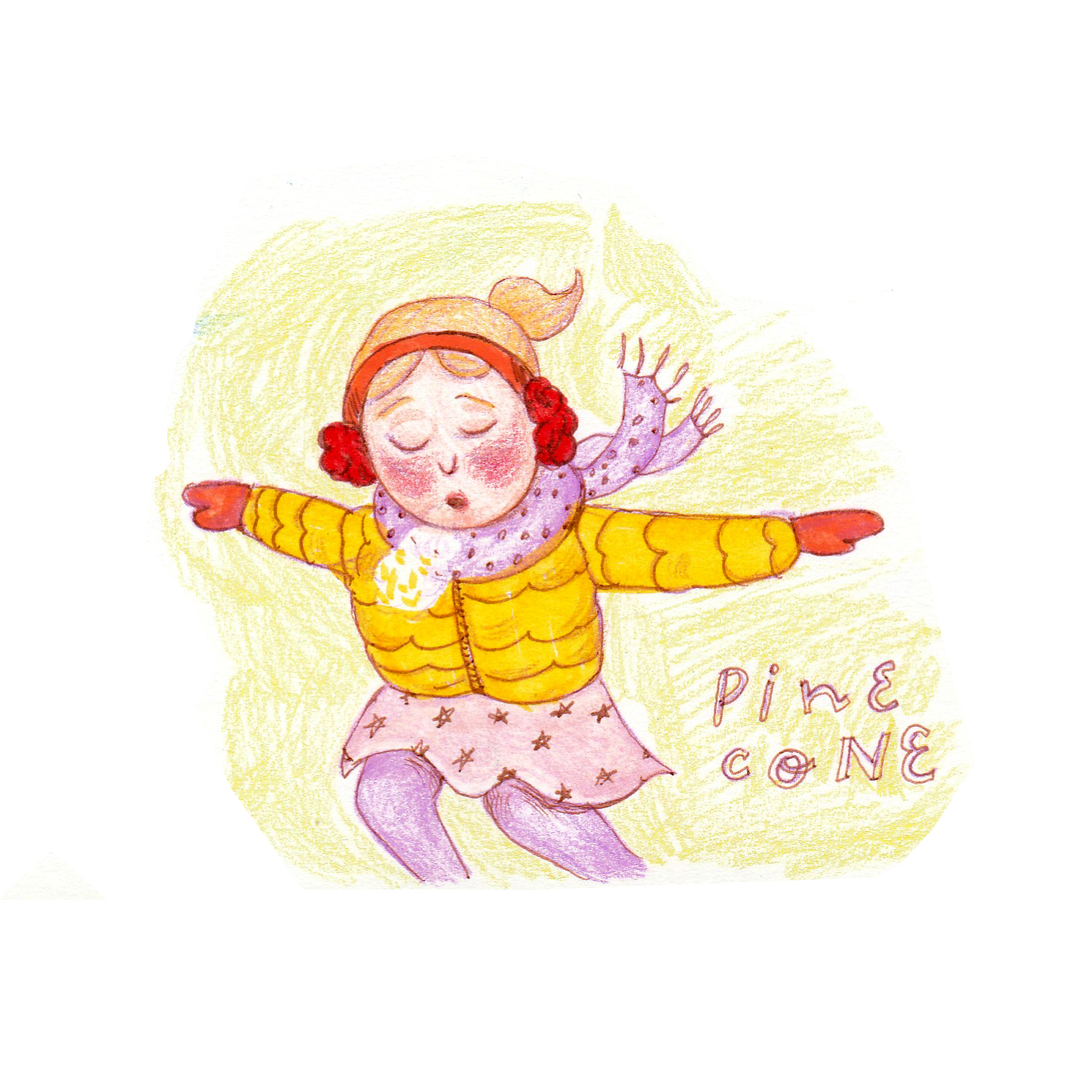
These drawings were made as an exercise to see how I would approach the illustration style of a storybook. It's one of my wishes to illustrate one some day and I had some free time before Christmas to play around with some watercolor and colored pencil. 

These were made mostly from imagination, but I did use some reference for the iceskating one and the four carolers, I did have some trouble with the latter one as I feel the color cheme could have been different or narrowed down to a smaller palette with one or two tones. As you can see, I still have a fondness for lettering and doodling words around my drawings.

Iceskating


Warming Up


Carols


Iceskater, Happy New Year

More info in the last part of this video from my Youtube channel.

Thank you for viewing,
Meruna.

Inktober 2018

So I did it! 31 drawings in 31 days - my first Inktober is official done and complete! 

In the beginning it was hard to find a direction, but using the prompt list - each day had a word assigned to it - really helped in easing my process. What really helped was to make tiny thumbnail sketches, and then sketching with a pencil on A4 or A5 size paper. The inking was done mostly with liners and marker, didn't use any real ink, and most of them got a digital background or even coloring - cause I just couldn't resist it! 

Some of them are good, some not so much, but I learned something from each one. Enough words, feel free to take a look below 


Thank you for looking,
Meruna.